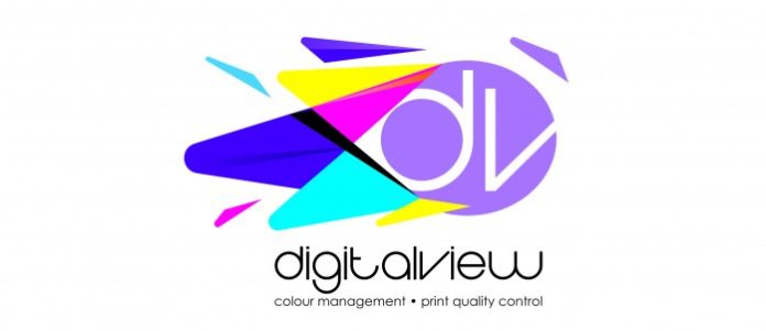
DigitalView has unveiled a dynamic and fresh new logo. The new logo represents the company’s mission built on a philosophy of service, to provide a broad range of best-in-class products, and ongoing support based on an intimate understanding of the ever-changing and deadline-driven nature of the industries they serve.
The new logo will debut at drupa 2016, and the branding will be introduced immediately on various digital platforms, including websites, social media channels, stationery and products. One of the many bene fits of the new logo design is its versatility to showcase iconic and timeless elements across all media.
In conjunction with the launch of its new logo, DigitalView has introduced the new tag line ‘colour management print quality control’, representing the company’s expertise and experience in the industry.
For nearly 19 years, DigitalView and its iconic brands have delivered innovative products and services for the printing and publishing industry in South Africa and companies across the world, growing from a small business to a broader connected supplier and partner. DigitalView recognised the increasing need for colour management and the tools to assist effi cient and e ffective outcomes.
Colour stimulates all our senses and as a result it has an eff ect on all our purchasing decisions. Most purchasing decisions are made emotionally and then justi fied by logic. While colour continues to be the heart and soul of successful brands and visual, printed materials, DigitalView’s new brand has evolved to stand for its dynamic understanding of powerful colour and volumes of energy. They highlight the impact colour has on emotions and it’s powerful subconscious eff ect on every part of our lives.
The launch of the new logo is the perfect tribute to DigitalView’s understanding and belief that the control over colour is not as complicated as you think, highlighting an exciting future for the printing world. Purple implies wealth, quality, fantasy and creativity. Blue implies honesty, trust and dependability. Yellow is an illuminating and uplifting colour which stimulates our analytical processes and assists with mental clarity. Turquoise balances and recharges the emotions and inspires good communication skills and self-expression. Indigo is a powerful and strong colour that conveys integrity and sincerity. It is associated with structure and rituals.
Magenta is a practical yet spiritual colour. Compassionate and kind, it encourages a balanced outlook based on common sense. Black is the colour of power and authority and white is a blank canvas waiting for creative stimulation. It implies effi ciency and simplicity, fairness and order. These emotions envelope not only a love of the industry, but also a compassionate dedication to the industry.


